Humanizing Crypto Space
Redefining Coinhako brand identity in the crypto space to give a more humanised crypto experience
My Role
Senior Product Designer
Competitor Analysis, Ideation, Branding Design
Team
Head of design, 2 Senior product designers, Joiner product designer
Tools
Figma
Adobe Photoshop
Adobe Illustrator
Why a Rebrand: The Problem
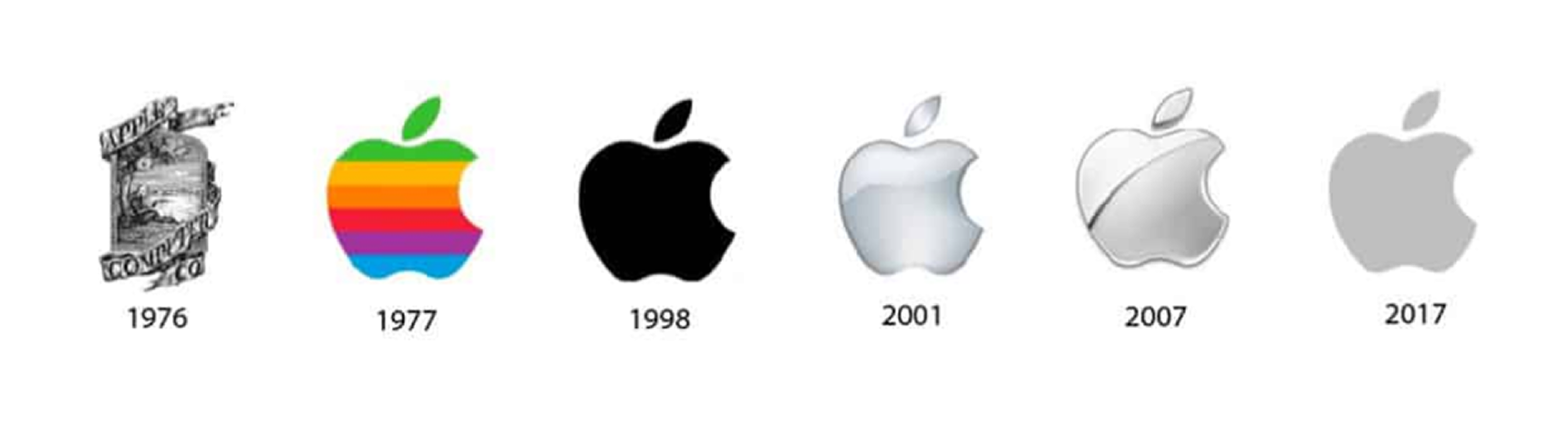
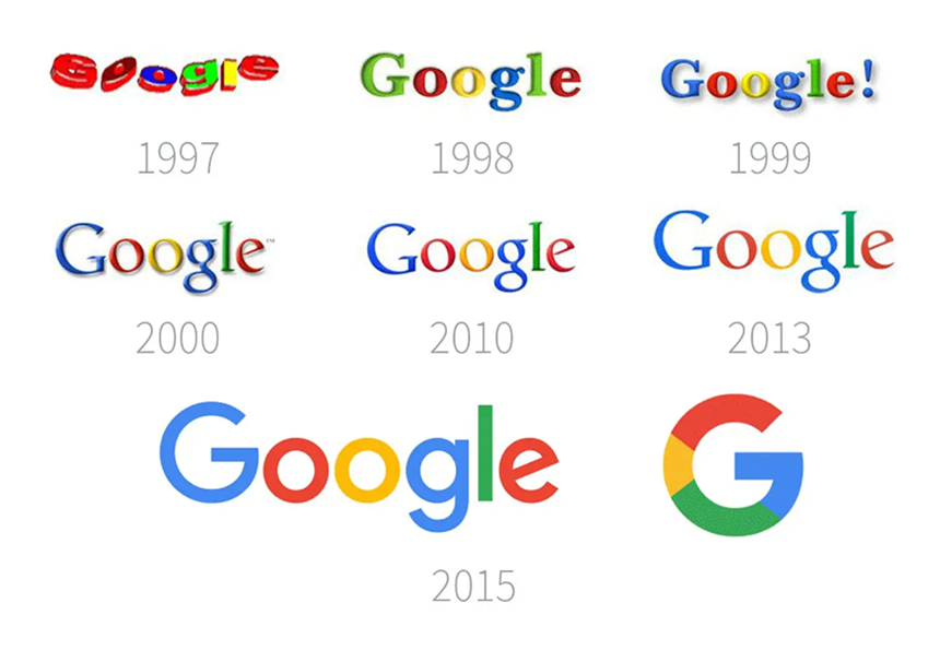
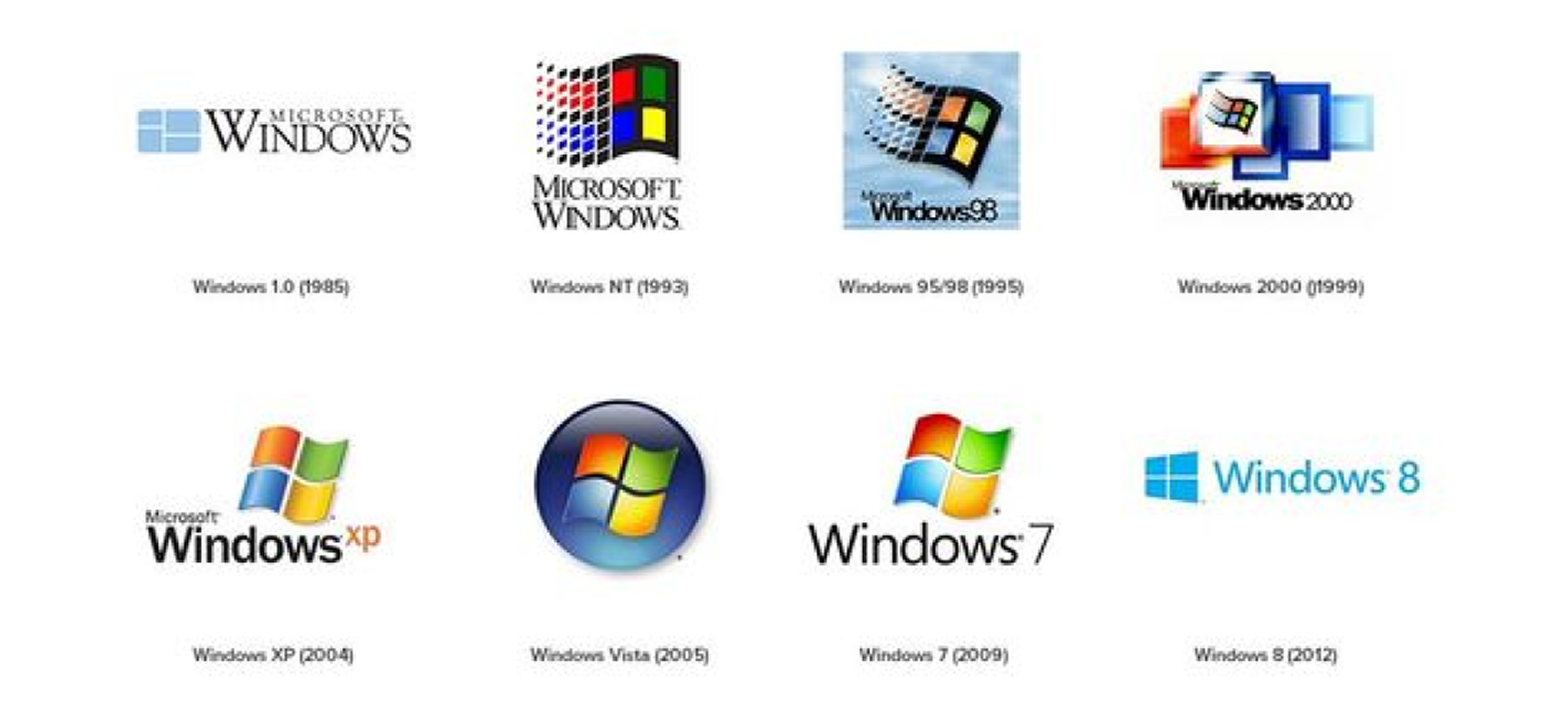
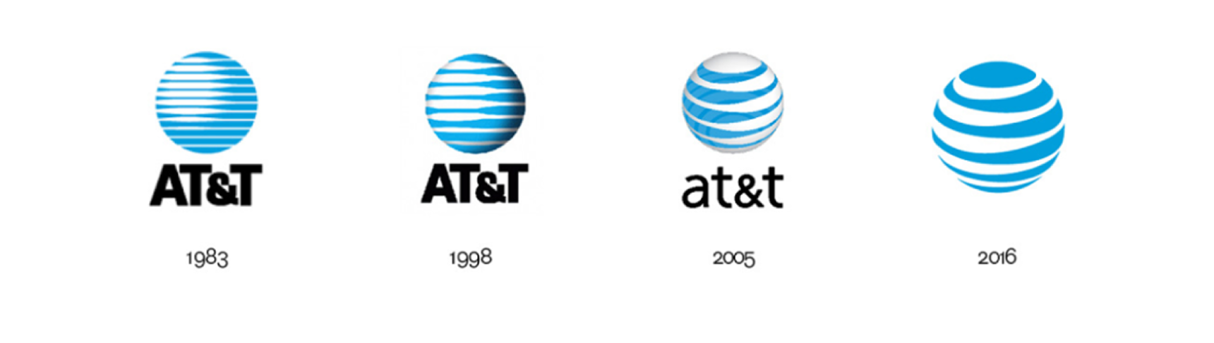
In the fast-paced realm of cryptocurrency, it's crucial to keep up with both tech advancements and user experience. Our products, once celebrated for their simplicity and functionality, have started to show signs of age, accumulating inconsistencies, unbalances, and design debts over time, throughout the evolution from the humble MVP beginnings to current state.

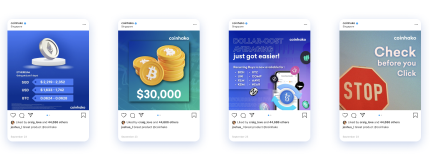
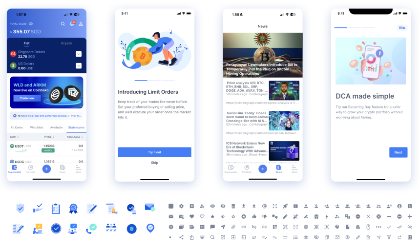
In a landscape where
competitors have surged forward, both functionally and visually, establishing a strong brand identity has become more crucial than ever. Our products, while robust in functionality, have lacked the cohesive visual presence that distinguishes our brand in the market. 

Recognizing this gap, we embarked on an initiative to revamp our platforms.

As we began exploring,
we found a significant disconnection between our company's overall branding strategy, product design and the new design direction of our products. To create a unified brand identity, we realized we must expand our rebranding beyond just the app revamp to a holistic rebrand including our public website, marketing materials and the whole visual presence.


This case study is all about our journey on reimagining and redefining our brand identity in the crypto space as a humanised crypto brand. But please see our whole rebranding exercise in here.
Current Branding
We are scattered
Our branding has scattered all over during the evolution and there is a significant disconnection between the company's overall branding and design direction.
Current Visual Design
During our initial research, our branding and visual design have taken multiple direction overtime. making us lack of clear visual identity.
The Color Palette
Paint it blue
The blue, is in our genes, right from the beginning, and it reflects our biggest value, the trust...
Colors are Key to a Memorable Brand
With the decision to undertake a rebrand, to align with our new design direction, we started a deep branding exploration to establish a new visual identity. As the first thing people notice, color plays a crucial role in establishing a memorable visual identity. It is not just about making something look pretty or aesthetically pleasing, but rather, it is a powerful tool for building brand identity and communicating with consumers. From increasing brand recognition by up to 80%, to influencing mood and perception, we realised how important it is to pick the right colors first. Coinhako was always blue and it’s in our genes. The selection of the color blue wasn't just a visual choice, it was a strategic decision deeply rooted in our core brand value: trust, but the question was, which blue represents us the better. Based on our target audience, we created a brand new color palate keeping blue as our primary colors.
Main Colors
Color Harmony
However, our brand isn't defined by trust alone. We recognized that our customers also value caring, safety, and simplicity. To create a cohesive and harmonious brand identity that reflects these values alongside trust, we developed a semantic palette. And each color was carefully chosen to evoke specific emotions and associations that align with our brand values.
Exploring a New Logo
Crafting our identity
In a crowded marketplace, a unique logo sets a brand apart from competitors. It's a visual cue that helps consumers distinguish the brand from others offering similar products or services.
Logo Makes a First Impression
Logo grabs attention and makes a powerful first impression. It’s the foundation of a brand identity. A great logo is memorable and separates a brand from the rest while fostering brand loyalty, and is expected by the brand audience. The deeper we dug, the more gaps we started to uncover. We felt something was off when seeing our logo on polished design materials. We realized one of the first things we needed to change is, the logo. Product designers on a mission to find a new logo for the company. None of us are logo designers but this exercise was exciting. Took us back to our visual design roots. We came up with multiple logo explorations and some of these logos were nice and interesting.
But wait, a logo holds emotional significance for both users and employees, as well as those involved in building the company. Introducing a completely new logo carries the risk of user confusion, potentially resulting in a loss of trust and identity.
Evolution of Logos
We did a deep dive into logo redesign. Our findings were quite interesting. There are great brands in the world and some are life long, and even longer than that. For almost all these brands, the logos that we saw as kids and the logos that we see now are different, or totally different. Even we see different logos now, the evolution of the logos are incremental from a version to version.
Starbucks
Shell
Pepsi
Apple
Google
Microsoft Windows
AT&T
Mercedes
Finalising the New Logo
The 3 percent rule
A 3% change broadens our perspective without making us uncomfortable. It introduces us to new things without completely changing what we loved.
The 3 Percent Rule by Virgil Abloh
Virgil Abloh, a visionary designer and creative polymath, is renowned for his groundbreaking approach to design that blurs the lines between fashion, art, and culture. At the core of Abloh's design strategy lies a relentless pursuit of innovation and disruption. He challenges conventional boundaries, redefining the zeitgeist with his unique perspective and fearless experimentation. Abloh's signature style is characterized by its bold simplicity, often juxtaposing high fashion with streetwear elements to create a dynamic and eclectic aesthetic.
Refreshed Logo
We followed the same 3% rule and tried to come up with a fresh and modern looking logo while maintaining the same characteristics. After a few explorations, we came up with two versions and after round of voting, we got a winner with a clear majority.
Designing Branding Material
Our representation in the market
Marketing materials play a vital role in promoting the brand, building relationships with customers, and driving business success. They are instrumental in increasing visibility, building credibility, and fostering engagement, ultimately contributing to the brand's growth and profitability.
Marketing Materials
Now we got the missing piece and jump back into branding explorations. And gradually we ended up creating social media banners, posters, business cards, letterheads and actually most of the branding materials.
Pro and Retail Banners
Institute and Global Expansion Banners
Product Banners
Social Media Banners
Collage Illustrations
Public Website
Our digital reflection
Public website is often the first point of contact between a brand and its audience in the digital world. It's a powerful tool for building credibility, fostering customer relationships, and staying competitive in the digital landscape.
Exploring on Public Web New Design
Now we have a sense of where are we heading. We started exploring the public website again. We took the modular approach and started to create different sections/modules of the website keeping our design direction in mind. This was fast spaced iterative process. After a number of iterations, finally came up with enough modules to cover our main landing pages, both institutes and retails. Now it’s just a matter of fixing all these building boxes or modules to create the pages. We might create one page for each or two versions for A/B testing.
Banner Variations
Content Sections
Testimonials
Growth
Reflection
Our Learnings from this Initiative
Key takeaways
Trust Your Skills
The whole team was product designers but our roots go all the way to visual designing many years ago. Despite not specializing in branding design, we trusted in our skills and successfully executed a comprehensive rebranding. This experience showed us the power of self confidence and the courage to venture beyond our comfort zones, would make you do wonders.
Walk Together and Win Together as a Team
We all got multiple skills and some unique skills too. This whole exercise was about working and collaborating as a team, while utilising each others skills to overcome challenges. Walking together was our super power to make this whole rebranding possible.