Simplifying Crypto Trading
Revamping Coinhako to make the most simplest and humanized crypto trading experience in APAC
My Role
Senior Product Designer
Competitor Analysis, Ideation, Branding Design, Lo-fi and Hi-fi Designs, User Testing.
Collaboration with Stakeholders, Product Managers (PM), and Developers to outline strategies for addressing key challenges.
Team
Head of design, 2 Senior product designers, Joiner product designer
Tools
Figma
Adobe Photoshop
Adobe Illustrator
Why a Redesign: The Problem
There are no timeless designs when it comes to digital design. What looked good years ago now appears outdated, it’s true for our products too. While our products initially appeared good and simple, they have started to look almost outdated now. Our platforms started as MVPs and evolved ever since. With all the enhancements, new feature additions, and evolution over time, there are a lot of inconsistencies, unbalances, and design debts accumulated too. Further enhancements to the product on current designs only pilling these up. And all the other competitors evolved a lot during the last 5-6 years functionally and visually, leaving us a few good laps behind in the race. Most have marked their branding and visual presence in the market already. But we still don’t have a solid visual identity in the market. Redesigning is gonna be challenging and risky at the same time. Plus, it might hit our engagement numbers too, at least for a short while, which making it tricky to show ROIs right away. But we realized it's better to do the redesign sooner rather than later, to give a cohesive and seamless user experience to our users as well as to mark our visual identity on the market.
Initial Planning
First things first
Now we know there is a problem, and there are so many solutions too... but we don’t know why!!! and what the right solution is. So why don’t we listen to real people and learn from them?
Design Process
Crypto space is volatile and fast, things are changing and new things are popping up to the market in a blink of an eye. To keep up, we need to deliver things faster too. Because of this nature of our business, in general, we use ‘lean UX’ as our design process in Coinhako. For this exercise, the problem was clear, the solution was already in sight, and time was tight. So we stuck to what works best for us, lean UX. Focused, collaborative, and fast.
Planning and Phasing
It was a challenging task, especially for a small design team like us with one junior designer and 2 seniors led by the Head of Design. And the agreement was to work only 50% of our time on the revamp since we have to keep moving all the other tasks too. So planning and phasing right from the beginning was vital to hit the goal. By the end of the planning sessions we phased out the whole revamp into two major phases (1. Design proposal/concept, 2. Final design revamp) and multiple mini phases.
Understanding our users, value propositions, and our competitors
Existing User Research Analysis
Our product team had conducted a user research a couple of quarters ago, and we decided to leverage those insights to save time for an in-depth competitor analysis. This research gave us valuable insights about target audiences, brand values, and solid guidance toward our design direction.
Our User Distribution
Our brand values are, trust, safety, simplicity, and care.
Regulatory compliance is crucial for me, and Coinhako being regulated by MAS gives me confidence.
Honestly, I trust Coinhako because it's regulated by MAS here in Singapore. It gives me peace of mind knowing they're following all the rules.
I've never faced any security issues with Coinhako. Team seems to be on top of things, and that gives me confidence in Coinhako.
Coinhako is pretty quick to fix anything if it does come up, which is nice.
Coinhako's platform is really easy to use. Signing up, and moving money around is quick and straightforward.
What I love about Coinhako is that it's not confusing at all.
 I've reached out to Coinhako’s customer support a few times, mostly for clarifications. Each time, they've been super helpful and responsive. It's great knowing there's someone there to assist when needed.
Competitor Analysis
We conducted a deep competitor analysis and placed our competitors under two quadrants, tone of voice and design. Competitor analysis showed us most of the competitors’ tone of voice is ‘techie, and between formal and casual’ and the designs are mostly ‘monochrome, and interactions are between transactional and experiential’.
Define Design Direction
Humanizing and simplifying crypto trading
Based on our initial research, we identified, that if we want to set our own mark and stand out from the rest while addressing our target audience, we have to set our tone of voice more towards human and balanced between casual and formal and our designs and interaction towards experiential and colorful.
This perfectly aligns with our core values which are trust, safety, simplicity, and care. Humanizing crypto trading became our design philosophy.
A disconnection
Things starting to align differently than we thought. There is a significant disconnection between the company's overall branding and the new design direction.
Initial Exploration
We kick started our exploration of design concepts from the public website for both retail and institutes and went all the way to the roots, to see how we started 10 years ago and the different stages of our evolution.
Identifying the Gaps
During this exercise, we uncovered a significant disconnection between the company's overall branding and design direction and a clear distinction between the new design direction. This new realization started to show signs of a holistic rebrand to ensure alignment across all touch points.
A Whole Rebrand
Change of plans
Proper planing is always vital for the success of a project but plans tend to change sometimes. If changing the plan, let’s change it to a right cause.
Exploring on a Complete Branding Direction
We shared these gaps or the disconnection with all the stakeholders and everyone started to realize the need of a complete rebrand. While accepting the potential risks involved, we believed that a whole rebrand was necessary to achieve a strong and cohesive brand identity. We restarted our exploration keeping the whole rebranding our goal. This case study is all about our journey on revamping our app to become the most simplest and humanized Crypto trading app in APAC. But please see our whole rebranding exercise in here.
App Revamp
Conceptual design exploration
Phase one of the whole project was to come up with the design direction concept.
Exploring App Revamp and Creating Conceptual Designs
Then we started on our app revamp exploration, for both web and mobile. The main focus was to figure out a design direction to make UIs look simple, clean, modern, and aligned with our new design direction. After figuring out the design direction, we started creating hifi designs on some major screens to illustrate the directions clearly.
Web Light
Web Pro
Mobile App
Proposal Presentation
The judgement day
Now it’s the time to reveal the months of our sweat and hard work. The moment everyone was waiting for. The proposal presentation.
Our head of design’s presentation of the proposal or the concept to all the stakeholders including the founders ended up being one of the most enthralling meetings ever. And that concluded the phase one of the design revamp.
The Phase Two
Concept to reality
Concept is all about playing with your imagination in your creative playground. Now it’s the time to test it with struggles and harshness of the reality.
App Revamp
With everyone's excitement on the redesign, everyone wanted to get those new designs out soon. To speed up the process, we thought, let’s divide and conquer. My fellow designer took the responsibility of the public website and I took the trading app. Now it’s the real deal, bringing the concepts to reality. During conceptualizing you get a lot of freedom, it’s mainly about using your creative imagination to define the design direction or the visual language, just like building the concept car. When creating the actual prototypes, you have to consider all the constraints, like usability, accessibility, and feasibility. This is when things start to get real or serious. We wanted to create a full fledge design system too, to reduce inconsistencies and to improve team efficiency. All aspects of design are something we can handle, but when it comes to development constraints and feasibilities, timelines and efforts… We got to sit together with product managers and engineers.
Cross functional Team Discussions
After rounds of discussions with project managers and engineers, we agreed on some vital decisions.
Make this mainly a UI revamp with minimal UX changes.
This allows them to refactor the codebase to make it scalable in the future without worrying too much about changing whole flows. Makes sense.
Creating our own design system.
Engineers preferred to use the Material design system, because they are already using Material design components. Yes, it’s a solid design system, but using out of the box Material design components makes our UIs look like native android. This is not going to be ideal for all our iOS users and this is totally against our design direction. Finally we agreed to create our own design system, while following Material design as the base but with our own UI layer.
Prototypes
Mid fidelity wireframes
We have thousands of ideas flying in our heads. Let’s visualise those ideas on a blank canvas.
Simplicity is one of our core values, so our goal was to introduce the new visual language without losing that. We ran a few quick ideation workshops with the design team, PMs, and stakeholders. Everyone was excited and brought great ideas to the table. After a few solid sessions, we aligned on priorities and jumped into design. To move fast, we started with mid-fis and quickly turned them into hi-fis. We tackled the main screens one by one, starting with the new Hub (our global nav), then the home, assets, coin details, trading, and account screens.
Mid Fidelity Screens
Back to work. Now it’s about bring ideas to life visually. We used mid-fi wireframes to move faster and easily transition to hi-fis later. We started screen by screen, beginning with the home and a brand new global hub for better navigation. Then moved on to assets, coin details, trading, and account/settings screens.
Visual Design
High Fidelity Mockups
Our wireframes are ready, just like skeletons without skin. Let’s bring life into it.
High Fidelity Screens
Now it’s about icing the cake. After wireframing, we synced with engineers and PMs to check feasibility and gather feedback. With tech constraints clear and goals aligned, we moved on to hi-fi designs while keeping things simple and true to our design direction.
Design System
Let’s define the direction
No direction is a proper direction until you define it. Let’s define it first, before we take different directions again.
Design System
In parallel to prototyping, we started to create our design system too, starting from the foundation, the color system, and typography and then into borders, radiuses, spacing, elevations, and components and variants on the fly.
Design System Foundation
In parallel to prototyping, we started to create our design system too, starting from the foundation, the color system, and typography and then into borders, radiuses, spacing, elevations, and components and variants on the fly.
Key Colors and Tonal Pallet
Key colors representing our value propositions and the tonal pallet from its’ tints and shades.
Extended Pallet
Extended pallet to harmonise the color distribution.
Typography
We chose Inter as our typeface; a versatile, well crafted font made for everything from detailed UIs to marketing. It supports 147 languages, includes over 2000 glyphs, and comes in weights from 100 to 900 with true italics and optical sizing for both text and display.
Typeface
Type Scales
Then we created type scales to address different use case across the app.
Icon Library
There are many of icon libraries available online. Most of them are pretty, comprehensive, and free. After going through a number of libraries, we decided to go with Tabler (tabler.io/icons) for it’s simplicity, and closeness to our design direction.
Key Components
While we are creating the hi-fi screens, we created components too, as soon as we finalise an element. This made the whole process faster and gave us the opportunity to test those components on different use cases.
Design Tokens
The bridge between design and code
It’s always hard and almost impossible to keep the code consistent with design, unless you have design tokens.
Having a design system is quite helpful when it comes to consistency and efficiency. It makes our lives a lot easier and makes our work a lot faster. But how do we make the design system useful to the engineers, and how do we make things consistent between our Figma designs and the code base? Design tokens, a bridge between the design and the code. Our engineers were quite positive about it and saw it as something really helpful for the same reasons, consistency, efficiency, and ease of maintenance.
Material design has it’s own token system, with a solid architecture and a naming convention. But we can’t make use of it since we are not using out of the box material UI. We had to come up with our own token system.
Token architecture
Few of the hardest things about creating a token system is coming up with a scalable architecture and a scalable and meaningful naming conventions.  After doing a bit of research, going through our UI inventories, and having a few brainstorming sessions, we decided to create a token system with three layers to reduce guesswork and to make it future proof for scalability. And use kebab case for naming, for clear separation to increase the readability.
Token System
There are a couple of ways to create Figma tokens. But considering carefully, we decided to use Figma native tokens.
Variable Scoping
Scoping a variable allows you to limit which properties it can be applied to. This gives you better control over where the variable can be used and cuts out the guesswork when designing.
Anatomy of Design Tokens
In a design token system, tokens are flowing through a funnel, pointing from one token to another before it’s been applied to a component. Here it shows the anatomy of the primary button background token.
Design Token Application
The final UI of a component is made from cascading different properties from a multiple tokens. This shows how designs tokens are being applied to a banner component in our design system.
Still WIP...
Where are we
This is still working in progress, but we are realising it to engineers phase by phase. We’ve already released our design system and they busy hooking it up now, and on the meantime we are getting ready to release our main screens and the the sub screens and flows.
Mobile App Revamp Timeline
Reflection
Our learnings from this initiative
Key takeaways
Proper Planning, Prioritising, and Phasing
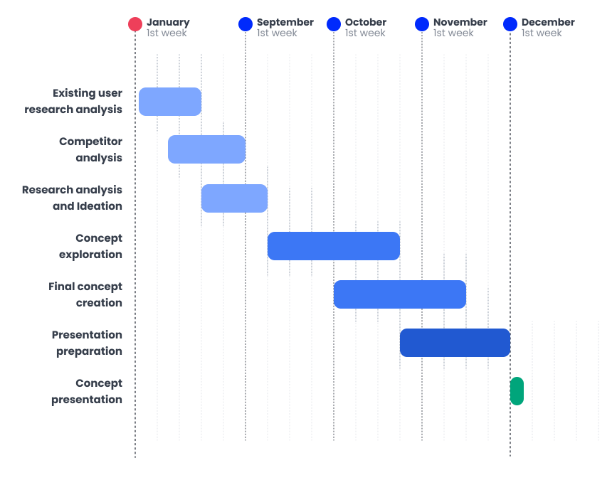
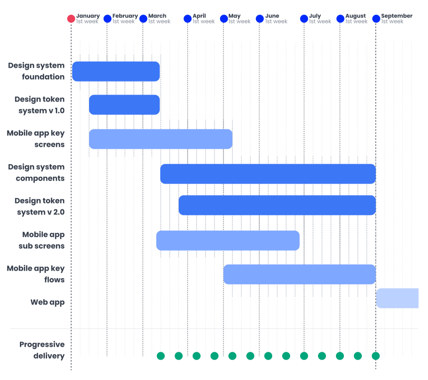
This was a huge task and we had a small team to hit the goal within a tight timeline with spending only 50% of our daily time. One of the first things we did was planing, prioritising, and phasing out. Having proper priorities and objectives kept us always on the track. Phasing out kept us away from overwhelming from the huge amount of work we had to do, and helped keeping our focus on a small task or few small tasks at a time.
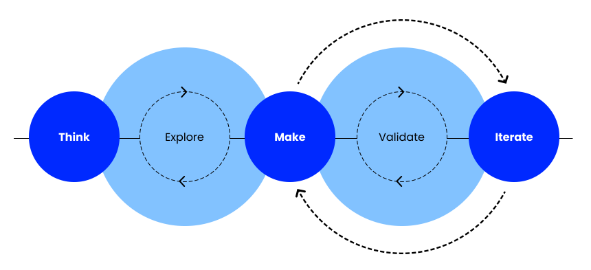
Adaptive Design Process
We followed almost all the steps of a usual design process but we customised, or used different methods to suite our needs. We didn’t do user interviews, but we analysed past user interview data, did some desk research and competitor analysis. We’ve done some ideation workshops. Instead of lo-fi, we started with mid-fis to make things faster. It’s not about not following a design process, but about picking the right methods for your task.
Continues Stakeholder Sharing
During this whole initiative we faced tight knots, we had to change our plans, take different directions. But end of the day what matters is alignment... alignment with stakeholders and be on the same page. We realised how important the continues stakeholder sharing is than surprising them with so many things once in a while.
Collaboration with Cross Functional Teams
End of the day, everything is a teamwork. No matter how user friendly and pretty our designs are, if it’s not feasible to develop, or not aligning with business goals or priorities, or not useful to the users. The key to create something works for all is the collaboration... collaboration with cross functional teams (engineers, product managers, sales, marketing, legal, compliance, etc).